THE STORY
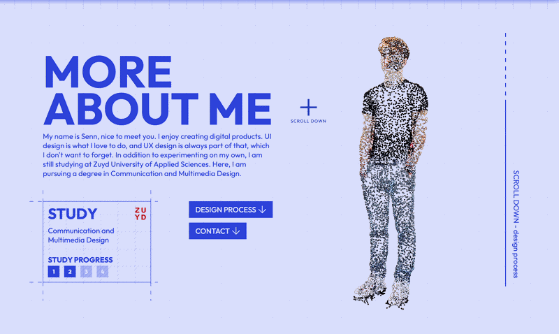
My portfolio is designed as a kind of digital “hub”: a single place where all my work, skills, and personality come together in a calm, thoughtful environment. Instead of just showcasing individual projects, I wanted to create an experience that demonstrates how I think, make decisions, and build a narrative. The navigation, interactions, and animations are therefore all intentionally designed to support that narrative, not just to look “pretty.” From the start, I’ve viewed my portfolio as a product in its own right. I considered how a visitor enters the site, where their attention goes first, and how they’re guided step by step through my projects. The interface remains deliberately minimalistic, allowing typography, white space, and micro-animations to subtly support the work. This makes the site feel light and intuitive, even as more content is added in the future.
HOW I SHAPED THIS
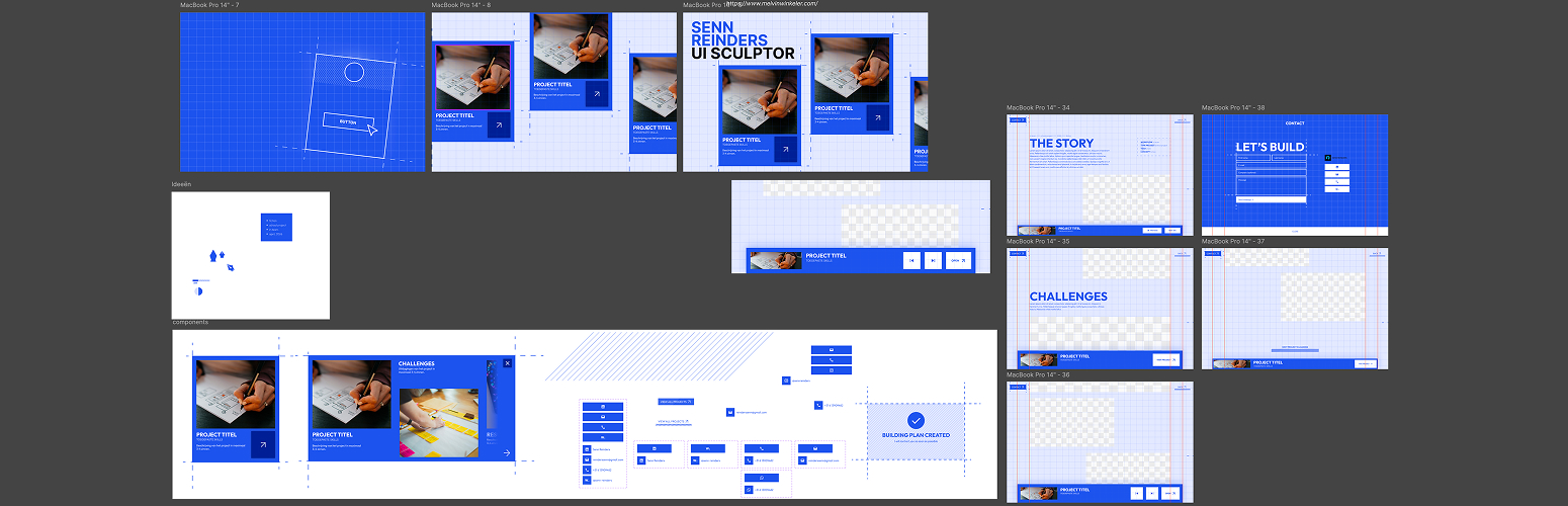
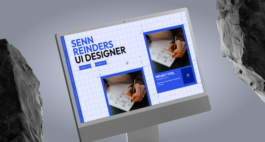
The design process began by mapping out user flows rather than individual screens. First, I identified the paths a visitor might take: entering via the home page, going directly to projects, or clicking on a specific item shared on social media. Next, I created low-fidelity wireframes to test the focal points of each screen: what you see first, where you’re likely to click, and how quickly you understand where you are. From there, I developed the blueprint-inspired visual language. Because this portfolio is a hub that reflects past projects and sets the stage for future ones, the site itself acts as a blueprint for new work.
CHALLENGES
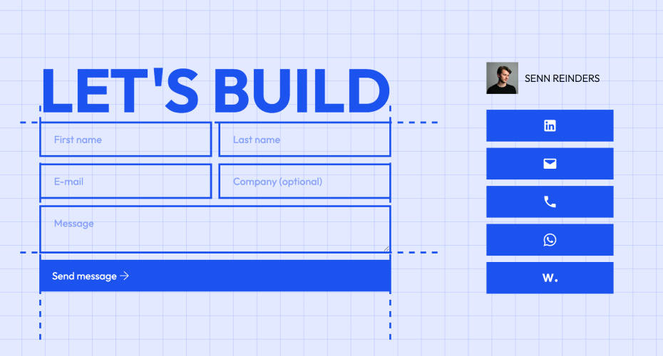
The biggest challenge was striking a balance between expressiveness and calmness. I wanted to demonstrate my sense of animation, transitions, and storytelling, without making it feel cluttered or “over-designed.” That required making clear choices about what to animate and what not to, which elements should remain static, and where I could dare to surprise the viewer. A second challenge lay in the structure. My projects vary in type, medium, and context. Yet the whole had to feel like a single story. That’s why I invested a lot of time in the basic structure of a project page: fixed sections for the story behind the project, my role, the process, and the outcome. Within that structure, there’s enough room for unique touches on a case-by-case basis, but as a visitor, you’ll notice above all that everything is told in a consistent and calm manner.
- workflow solo
- type project personal
- year 2026
- client none